memes.cjtrowbridge.com
Category: Urbanism - Housing -> This Meme
llama-3.2-vision
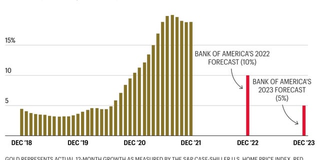
The meme is a chart showing the growth of the S&P 500 stock market index from December 2018 to December 2022, with a red line indicating Bank of America's 2022 and 2023 stock market forecasts. The chart shows that the actual growth of the S&P 500 was much higher than the Bank of America's 2022 forecast of 10%, but lower than the 2023 forecast of 5%. The chart is meant to be humorous, implying that the Bank of America's 2023 forecast was so low that it was actually a prediction of a 5% drop in the S&P 500.
first-seen
2023-05-10T20:59:59+00:00
tesseract
15% BANK OF AMERICA'S 2022 FORECAST (10%) 10 \ BANK OF AMERICA'S 2023 FORECAST 5 (5%) DEC 18 DEC ‘19 DEC‘20 DEC ‘21 DEC ‘22 DEC‘23